Well, in my opinion anyway:
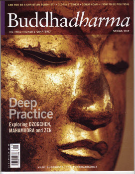
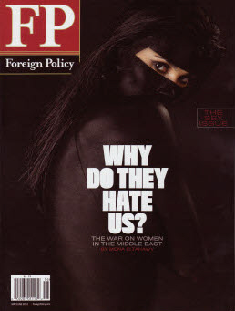
Buddhadharma is on my path to the front cash and I would often be arrested by it's cover. The simplicity of it is beautiful. The closeup and sharpness of the photograph is enhanced by the golden glow. The text on the cover completely encapsulates the image. We certainly know that it is an anniversary that Maisonneuve is celebrating!! The 10 is wonderfully bold with a clever use of their logo. I have always wondered who the character is that they use. I turned to the masthead and there it is: They refer to him as the "Maisy guy" though he symbolizes Paul Chomedey de Maisonneuve, the founder of Montreal. A big congratulations to you Maisonneuve, a feisty, independent magazine. Last Tues Foreign Policy arrived. Again the simplicity grabs you as it is so startling both in the strongly worded text and the striking image of the eyes staring at you. Garden design has lot more text on its cover but the main "Perfect Courtyard supports the photo. The flames jump off the page as though they are alive and dancing in front of you.


